

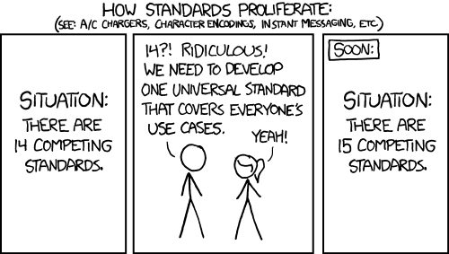
What are your wackiest ideas for a “universal” controller layout that would appeal to the fans of the Xbox, Nintendo, and PS layouts? You certainly can’t pick one of the three, that would be lazy and frankly unfair for the other two layouts. It’s got to be something that everyone agrees on, something different!
I’ve got a few ideas: NSEW (the cardinal directions), RGBA (colours, also transparent button could be cool…), or maybe CMYK (printer ink colours for ease of printing)
What are your ideas for the universal controller layout?
Ouch, my career
X on the right so nobody is happy
Introduce ‘Ω’ button
placed in the center of the dpad
wipes and restarts connected device on press
touch sensitive
It already exists.

It has to be symmetrical. The asymmetry that Xbox uses is just so uncomfortable.
I don’t really care too much what the buttons are called. I grew up with PlayStation so its button names are the easiest for me to recall. That bias aside, I do think there’s something innately easier about the four shapes than memorising where X, Y, A, and B go, and numbering the buttons R1, R2, and R3 is simpler than the weird names Xbox users use.
I personally prefer the asymmetric joysticks over the playstation symmetrical ones. RB, RT is descriptive of the button itself. B being Bumper and T being trigger.
I do agree with you in the shapes being more memorable though.
But how do you remember whether it’s the bumper or the trigger? Counting downwards 1 and 2 is easy. Knowing the one they’ve named “bumper” and the one they’ve named “trigger” is…less so.
I remember it because one is a bumper and the other is a trigger. Bumper like the front of a car, and a trigger like…a trigger.
I have no idea what makes one a “bumper” and one a “trigger”. The only meaningful difference is one is on top of the other.
One is a trigger lol
and the other one is a bumper
Someone else pointed out that when you say “trigger”, you mean like the trigger of a gun, as opposed to in the sense I was thinking, which is in terms of event scripting, where a “trigger” is the event that causes another event to begin. I was thinking of it like that because, well…none of the buttons look even remotely like a gun trigger to me.
It was clearer in the 360 days when the trigger was narrow. Now that it’s as wide as a bumper the distinction feels a bit dated. I still prefer the 360 triggers, they felt great for fine control.


The form is similar and in fps games the use is the same
the trigger is like the trigger of a gun. the bumper is a bump/bigger button
In what way are any of the buttons like the trigger of a gun? Plus, unless I’m mistaken, isn’t the bigger button the one you’d call a “trigger”? Just picking up the USB PS2-shaped controller I bought off Ebay, R2 is definitely the bigger button by a large amount, and I thought R2 is the one you’d call the “right trigger”. Am I misunderstanding something?
Bigger button as in, compared to the XYAB/Symbols buttons. The bumper just feels like a big button you press down. And the trigger does look like a gun trigger, due to the shape. Well, at least on an Xbox controller
I think the asymmetry is great! It makes it really easy to move my thumb off the camera stick to grab the dpad without letting go of movement or doing the claw. I like the aesthetic of a symmetrical controller, but offset sticks just works better for me.
Camera?
Right stick, generally used for camera control. Reading my comment back that’s super unclear lol
Oh ok I see. I don’t really see how it matters for that purpose whether it’s symmetric or asymmetric. When moving the camera your hand is in one position, and when using the buttons for things like jump, attack, interact etc., your hand is in the other position. You have to use both positions either way. So I’d rather the kind of natural position of both hands resting on the analogue sticks is symmetric rather than twisted.
on the xbox controller the D-pad is to the left of the Right stick, meaning you can easily move your thumb over it to use it in certain games (like in Dark Souls, you use it to change equipped consumables/weapons). Whereas with the symmetric design, you’d have to move your right thumb a bigger distance, and also get in the way of your left thumb (which is on the left stick for movement). Ofcourde, you can always let go of movement to switch items, but that’s not always an easy option (Bossfights, enemy encounters, ehere you have to be moving constantly)
That’s just one game i can think of where the asymmetric dedign is better
Wait, you use the d-pad with your right hand on an Xbox‽ I’m gonna be honest, I can’t even imagine wanting to do that, and it feels like it would be bad game design if a game necessitates it.
But if you did want to do it, I’d say your best option in a symmetric design would be to use your right thumb on the left stick. It’s a little awkward, but it’s only for a split second, which IMO is better than sacrificing the comfort of the design as it’s used 99% of the time.
Usually, you use the D-pad with your left hand. But in dark souls, movement is done with the left analog stick. Otherwise, if d-pad is used for movement (and not item switching), you use your left hand
Not ALL the time. For the most part, you use your left thumb on the left analog stick and the D-Pad, and your right thumb on the right analog stick. But, SOMETIMES, you have to keep your character moving with the left stick while at the same time switching weapons/items with the D-Pad, especially when escaping a tough situation.
R1, R2 and R3 are endlessly confusing to me. I still mix them up sometimes after over a year of owning PS5. It makes no sense that they aren’t in any order! It should be 1 - trigger, 2 - bumper, 3 - stick or in reverse. In order in the top - down axis.
The order makes sense to me. R1 is the top button. R2 is the bottom one. We usually read top to bottom so that checks out.
R3 is the weird stepchild option. It goes last precisely because of how weird it is and how rarely-used it is. Or at least was, back when I was last playing games on a console, during the PS2 era.
Historic order. L1 and R1 (LB and RB) first appeared in the Super Nintendo ( 1991), L2 and R2 (LT and RT) made their debut in the PlayStation (1994) and L3 and R3 came out first in the PlayStation 2 (2000), I think.
They could choose any name other that L3 and R3 though.
That’s what PlayStation calls them. Xbox calls them LSB and RSB (Left/Right stick button). Nintendo has no name for them, they just refer to them as “clicking the left/right stick”. Also Nintendo calls the bumpers L and R, and the triggers ZL and ZR.
LSB and RSB are so much better in my opinion. They actually have meaning so you don’t have to remeber an arbitrary number.
The Steam Controller was perfection.
People don’t want to hear it. But you are right.
Controller layout was mastered with the GameCube and I will harbour no dissent
Unironically though it has a fantastic conversation with you as soon as you see it. A is obviously primary, B is obviously secondary and X and Y are clearly tertiary and equal.
Actually yeah, this has merit. I see a few places for improvements though.
- I’d swap the d pad and yellow for joysticks, playstations mirrored joys are generally better for your thumbs over time.
- replace the round B button with another bean shaped button like the X and Y, add a 4th bean button in the lower corner and color code them.
- Bumpers and triggers, but use the mechanical style the 360 had, they were durable and reliable.
- extend the palm pads, the ps4 had a really good feel in the hand, not too small, not yo big.
- attach fans to the rumble motors and air flow holes around the palm pads. Sweaty hands on a controller suck, active cooling during intense moments would be great.
amen! i’m not bothered by different glyphs as much as i am by everyone making the primary button different (although i guess now xbox and ps agree) and that just doesn’t happen with a physical controller that has an obvious hierarchy of buttons. plus B A and X all being in a line makes them all accessible with the natural wiper motion of the thumb, way easier for my arthritic mitts to find their way around than two rows of two
Bring back octagonal gated analog sticks.
“When is Lindsey coming out of the closet? We all know you’re gay, Lindsey… and that’s ok.”
why does this sound life-threatening then ?
Shit, wrong thread, sorry
She’s pressing all his wrong buttons.
I mean, I’d go back to Sega-style six button layouts.
Also, leverless controllers. Better for your hands, more effective. The one example I’ve seen of adding dual sticks to those is… not going to replace pads for 3D games any time soon, though.
I think for the button layout, if you keep the cross shape you can do directions (up/down/left/right). NSEW could work. Ultimately, though, the most rational one is Xbox and the most universal is PlayStation (in that it doesn’t rely on a specific script). Frankly, at this point Nintendo’s “we give up” solution of showing four dots with the relevant one highlighted may be the only way to fix this whole situation.
Also, also, D-pad above forever. Only valid choice. Fight me.
What’s a leverless controller?
Think an arcade stick but instead of… well, a stick, it has buttons for each of the directions. Looks like some variation of this.
They’re good. I don’t like the “thumb to jump” thing that most of them do, but you can get them with a d-pad shaped directional thing instead.
That just feels like keyboard controls with extra steps
Now you got it.
Really, really good for 2D games and fighting games. Tetris-like games, too.
Everyone could learn a thing or two from the Steamdeck. The twin sticks, the touch pads, the double shoulder buttons, the four on the back, the overall ergonomics, it’s really great to use.
I like PS glyphs because they are language-neutral and look more distinct, and I think, it would be point one in my choice. Point two is color-coding that helps most people (but may adjustments for accessibility?). Point three although ofercomplicating things is direction-coding, as it’d be generally nice to have a > shape near them, so they’d read intuitively from the first playthrough.
My initial thought went for second set of arrows. Like d-pad has one kind ⬆️➡️⬇️⬅️ and buttons have the other 🔼▶️🔽◀️. But I doubt it would be consisntetly great in different games with their own visual approach to portraying them.
Having more direct sign buttons on the other hand ✅️❌️❓️❕️ may be limiting to what devs want their game to be as it implies the check button is always approval, etc.
Math symbols, tho, ✖️➕️➖️➗️🟰 can be a universal and neutral set to pick from, especially if avoiding the confusing X button.
Also, ♤♡◇♧, in connection with older modes of gaming, but it should be tested for illegebitility between them and compared to arrows as three of them have vagualy triangular shape.
Also loss buttons.
I know OP’s rules say no picking one of the three already, but these are such good points I can’t help but agree. I’m also biased from years of using a PlayStation controller. Even though I haven’t owned a PS console since PS2, I’ve still been using the PS4 & 5 controllers for PC gaming.
I think legibility and avoiding overloading symbols is top priority and the PlayStation glyphs achieve this admirably. On a pettier note, I’ve never liked seeing a prompt with a big, red B button pop up on screen telling me to do something, it’s very immersion breaking. While the PlayStation prompts aren’t exactly diegetic themselves, they’re at least less non-diegetic I guess, if that makes sense?
I won’t argue symmetry vs. non-symmetry of control sticks as I don’t really think there’s a correct answer here, it’s very preferential. I obviously prefer the symmetric, but I think there’s a reason the DualShock has undergone only minor changes since it was first introduced in check notes 1997?! JFC, that’s almost 30 years …
That’s immersion 🅱️reaking, lol.
I vouch for symmetry, or rather important buttons not being placed on the bottom. Active movements and especially button presses, e.g. in QTEs or multiple menus, are rather uncomfortable there, while sticks employ a different and less demanding moveset of slightly tilting them to the side. I don’t see a reason why it’s assymetrical on Xbox and I feel it’s really dumb in autonomous Joycons with Nintendo party games when they should be completely interchangeable when shared between casual gaming persons.
I like the suits!
a modular controller with options for steamcontroller pads. 2 joysticks. 2 dpads. 2 sets of 4 buttons. still got triggers and paddles and every thing is customizable.
cool, but I would imagine the controller to be pretty chonk
if its modular you can add and remove bits. plus you can 3d print the opensource parts so it can be as chonk or as smol as you like
THAT would be cool
It would never catch on, cause people don’t like change :p
But if there was one, it’d probably make sense to go with directions/arrows (←↑↓→) it’d be the least amount of memorization, since everyone from every language can guess that the button you need is the one at the tip of the point in the picture
Those might get mistaken for directional buttons. I had the same thought. Maybe I triangle with the point in the direction of the button, but you may run into the same issue.
I think to avoid that, it might be easiest to just show the four button layout with the correct button highlighted.
This is what Nintendo does on the Switch when the sideways joycon is supported and it works well. It may break the OP’s rules, though.
That too :3
But any symbols you choose to put on the buttons themselves are gonna be arbitrary mostly
Xbox adaptive controller

Whatever the layout, bring back the Dreamcast VMU. Maybe we don’t need the external memory anymore, but the little display with extra game details was so cool.


