
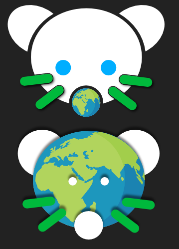
Hello, this is a follow up on my previous post, where I showed off the upper logo. I changed some stuff, as was suggested in the comments of that post. And I am looking for some more advice (:
I’ll repeat what I said there: I am just doing this to learn a little bit about creating logo’s, so I am not trying to actually make the logo for lemmy.world. Though anyone is free to use my logo’s in any way they see fit.
Thank you (:
The top one is a stronger design. It could be the size, but it still feels too bright to me. Dark mode FTW!
The bottom one is ok, but those drop shadows were a poor choice and should be removed.
Not sure if the whole context here, or what your redesign goals are.
Personally I think the current version is pretty good. What are you trying to achieve?
Edit: Sorry. I just reread your post. Not sure how I missed it. So I think both designers are kinda busy. Especially if they were to be scaled down like in the top left corner of the web interface. I think limiting to just 2-3 colors would help a lot. And focus on the idea without getting to into the details.
They both suck.
Username checks out I guess?
Well, I took issue with how brutally honest you were, but then I saw your username and felt it was very much on brand.
I don’t know what I expected…
They look like a cheap snoo knockoff.
The top logo… Why not add color into the ears, like half circles where they attach to the head? At present, all the color is happening in one area only and it feels unbalanced to me. (Me, just some random person with no training in anything resembling art, design, or advertising!)
The lower one looks angry due to the placement of the map on the face. It has a furrowed brow! Heh
The bottom one looks angry
Top.
Can you remove the shadows on the bottom eyes? I think that’s why it looks off.
I prefer the top, but I’m afraid the globe won’t be recognizable at icon size. It will just look like a green dot.
Top one looks great.
I like the concept of the bottom one, I think with the top one the details of the earth would be lost when the logo is seen at its normal size
deleted by creator
The upper one looks better. I would make the earth more colorful 🤔
deleted by creator
I prefer bottom. Only issue is its a little … busy. You could fix this in a few ways, could play around with the colors for a pair that has less contrast, could get rid of the eyes, could reinforce the exterior lines…
But you could also try leaning into the busy-ness and just go crazy and make everyone zoom in. Make the nose our moon, and make the ears Mars and Venus.
Logo’s what?
deleted by creator


