

(Generic label used for illustrative purposes)
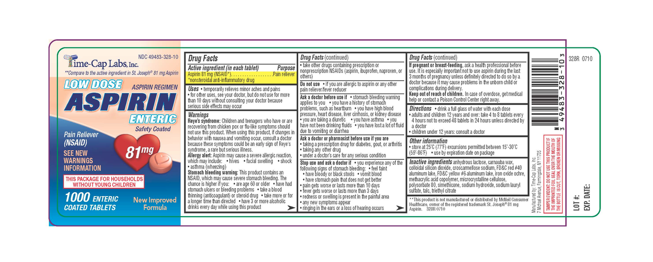
Instead of having the directions clearly, consistently, and conveniently at the top, it’s expects you to unfurl the damn label like a scroll, read through the tiny print until you get to the directions and dosing information.
I’ve already got a headache. I don’t need to be squinting at this tiny text to try to find the one bit of relevant info I need. I just want my headache to go away for a while.
It’s not just aspirin, ibuprofen, etc. It seems like everything with a label is like this now.
I understand how it might be personally upsetting, but products should have warnings and health guidelines before the instructions. If I’m supposed to wear gloves before touching something, I sure hope I see that before I see how to use it. This is actually good in my opinion. People might not actually read it all, but at least safety information is front loaded.
I don’t disagree, but prioritize to what people need to know in daily use instead of burying the lede in a sea of boilerplate.
I’m old, so I remember product info/safety labels before they turned into this. If you need gloves for something, step 1 was usually “Put on gloves”.
Step 1: what is this and what is used for and what’s not used for.
Step 2: put gloves
Steps 2.1 to 2.n: every single case were gloves are not enough based on age, weight, health factors, other medicament, work…
Step 3: the many things that can go wrong and what to do in any case.
Step n: now you can take it.
Now you have a full prospect.
deleted by creator
Ugh, I’m not optimistic enough to dispute that. Surely there must be a sane middle ground between unregulated free-for-all and forcing people to read through a whole MSDS just to see if they should take 1 or 2.
Safety regulations are written in blood, but warning labels seem to be written in stupidity and litigiousness.
Soon it will be a qr code that leads you to a website that shows you ads, recommends new medication, and fingerprints your device to sell the data of how often you take etc medication to insurers and anyone else willing to pay.
There will be even more text stating about how you can’t sue them if you od and that you agreed to the terms by taking the medication.
Hmm, that’s too optimistic now that I think about it. The qr code will actually take you to an app store.
It’s because of stupid people.
The point is, it would be better for stupid people if the dosing was clearly and immediately labeled without needing more action than just looking at the bottle. I shouldn’t be fiddling with resealable adhesive on the instruction booklet to see “adults: take 2”
you mean like this?

The main issue the OP is saying is how tiny the text is, and that it’s hidden in the middle of a sea of text. You only take medicine when you’re feeling like shit, so having to squint and find information that is vital to your health is a tad annoying. RIP to anyone with dyslexia, poor eyesight, hangover/drunk, etc. trying to read these labels quickly or in pain.
RIP to anyone with dyslexia, poor eyesight, hangover/drunk, etc. trying to read these labels quickly or in pain.
I do get this point; however, if you have trouble finding or reading this info, it is probably unsafe for you to take any medicine without assistance
Have you never had a medicine bottle that you needed to get a fingernail under a tiny tab to unstick some adhesive to get to the dosage? Do you think everyone who doesn’t have fingernails should just have to guess? Do you think everyone with vision impairment should NEED assistance to find the number of fucking Advil to take? Give me a break.
Make it so the directions are clearly visible without extra steps.
Not disagreeing it could be easier but people seriously underestimate the dangers of OTC meds… you can easily fry your liver
Which is why they should be more clearly labeled…
This is not a sea of text. The structure is clearly outlined (literally), with each section stating in bold what it’s about. If you cannot comprehend this, the problem is your reading, or more precisely, your skimming skills.
Idk…I struggle with this too like the OP said. Yes, the directions are there. But notice how that paragraph was hidden within walls and walls of text.
If they put it at the top or at the very least bolded it or made it in a different color or literally anything, it would be way better for everyone and even more idiot proof.
Are we talking about the same picture?
The text is already clearly structured into sections that each have a bold frame visually indicating them along with bold headings for each section.
It took me like a few seconds to skim to the relevant part of the outline clearly labeled “Directions” and I am neither a native speaker nor have I ever seen a label like this before.
Maybe you’re wired different. I skimmed the whole thing twice, specifically looking for the directions section, knowing how it should look. I missed it the first time…I thought the joke was that there weren’t any directions, or they were hidden on a page 2.
Maybe my ADHD mind?
I definitely get what OP is saying tho. Having an unknown and changing number of warnings, before the directions, in the same typeface as the directions, could make it more dangerous.
Ideally there would be a color-coded label system for different types/severities of warnings, and the direction clearly printed above/near the top. Having all the warnings first didn’t make me read them, just the bolded parts, looking for the directions. Directions are the most looked-for thing, they should be in an obvious place.
This is like the drug companies following supermarket logic, putting the milk in the back corner of the store hoping you impulse a bunch of stuff on the way. But instead tricking the customer into learning something, the customer says “all this science shit is boring and scary sounding” and they go get the raw milk from the farm stand because that doesn’t “need” warnings.
Well, I got ADHD, too. So that probably isn’t what makes the difference.
Yes, but CLEARLY VISIBLE WITHOUT EXTRA STEPS. I shouldn’t have to unstick/restick hidden bullshit just to find out how many pills to take. You know like how fire exits need to have single-step door openings?
General rule:
Ibuprofen: you’re not gonna OD, but it’s bad to take it to many days in a row
Tylenol: safe to take consistently for a long time, but dangerous to exceed dosage
Aspirin: no ideaI am not a doctor so… Probably ignore what I said and play it safe
When you exceed the recommended dosage: aspirin fucks your stomach, ibuprofen fucks your kidneys, acetaminophen fucks your liver, and Aleve fucks your heart.
For ibuprofen, you have to exceed the dosage by a large amount; you have to be really trying. This is evidenced by the dosage information on the packages themselves, which are totally inconsistent: 2x200mg 4 times a day is the max… But so is 2x400mg 4 times a day. But 2x600mg 4 times a day is the prescription dose. The more relevant danger of ibuprofen is chronic use, which can cause severe stomach issues.
At least this is what I’ve been able to find. But I still follow the dosage on the bottle because I’m not gonna risk it for a headache.
Second hand and circumstantial, but a nurse I meet worked with patients with severe kidney damage. She claimed A LOT were frequent ibuprofen users that by the time they realized something was wrong it was too late. One of the worst ways to go.
Yeah, from what I can tell if you frequently use ibuprofen it can be a problem. I thought it was mostly stomach but I’m not a medical expert so some of the sources were difficult for me to understand. Maybe it’s kidneys too. Or maybe I’m completely mistaken.
Tylenol: safe to take consistently for a long time, but dangerous to exceed dosage
In Germany Tylenol flies under the name Paracetamol, and my pharmacist specifically warned me against using it unsupervised for more than three consecutive days. Tylenol is toxic to the liver.
Weird to see a trademarked drug as the only ingredient listed. This would not fly in the EU.
Acetylsalicylic acid and whatever milk powder you have in those pills for delivery.
It’s the only active ingredient listed. At the end the inactive ingredients are listed.
Please note that the maximum dose of paracetamol/acetominophen is 4 (4 x 1000mg) a day. You don’t want to take any more, because dying from that stuff isn’t pleasant and easily done.
Exactly. And cut that in half if you’ve consumed any alcohol in the last ~12-24 hours.
That’s the kind of information that should be front and center without having to search the tiny text in the whole label.
Ever listen to the voice over in the commercials for <insert name of drug you don’t need>?
After telling you how much better the drug is than the competitor, but before imploring you to “ask your doctor if <$1> is right for you”, they list the side effects, which often include a worsening of the condition it treats as well as death, all while a bunch of actors get paid to show you what the best scenario looks like.
It’s the same thing, but for illiterate hypochondriacs.
deleted by creator
I’ve a list of all the drugs I know from commercials - started writing a song about them all, just need to get the bridges done between verses.
deleted by creator
I want to see the old hiding behind a newspaper gag replaced with this before its switched out with a qr code to download an app.


