Mickey7@lemmy.world to Lemmy Shitpost@lemmy.world · 1 year agoInteresting new symbols for bathroom doorslemmy.worldexternal-linkmessage-square76fedilinkarrow-up1430arrow-down149
arrow-up1381arrow-down1external-linkInteresting new symbols for bathroom doorslemmy.worldMickey7@lemmy.world to Lemmy Shitpost@lemmy.world · 1 year agomessage-square76fedilink
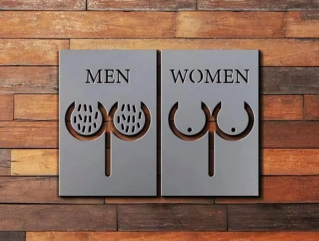
minus-squareMyTurtleSwimsUpsideDown@fedia.iolinkfedilinkarrow-up43·1 year agoThat “qp” outline has to be an establishment’s logo, right? Otherwise, the forked scrotum and bifurcated torso it don’t make sense, anatomically. Distinguishable, yes, but puzzling otherwise.
minus-squareKaelygon@lemmy.worldlinkfedilinkarrow-up5·1 year agoFinnish bank osuuspankki logo comes close to qp outline, but it has extra shaft at the top


That “qp” outline has to be an establishment’s logo, right? Otherwise, the forked scrotum and bifurcated torso it don’t make sense, anatomically. Distinguishable, yes, but puzzling otherwise.
Finnish bank osuuspankki logo comes close to qp outline, but it has extra shaft at the top
A q p
   W