
1136·
11 months agoThe only person who said 3 days was some random US general, why are y’all using it as some sort of gotcha?
The only person who said 3 days was some random US general, why are y’all using it as some sort of gotcha?
WaPo just publishes Bezos’s marketing emails.
lol you didn’t even bother clicking the link did you?
VOA is part of the U.S. Agency for Global Media (USAGM), the government agency that oversees all non-military, U.S. international broadcasting. It is funded by the U.S. Congress.
Type: Statutory corporation with a royal charter
A statutory corporation is a government entity created as a statutory body by statute.
It doesn’t matter what language you try to couch it in, “state funded”, “editorial independence”, whatever. It was founded by the state, is funded by the state, and is a government entity. If it quacks like a duck.
mediabiasfactcheck, the site that squashes two complex spectrums (left vs right, unbiased vs biased) into a one dimensional line, making no distinction between centrism and being unbiased.
and reliable reporting as you can get outside the BBC
“Russian state owned media bad. British state owned media good.”
I guess you’re just assuming it’s bad based on its name
No, we know it’s bad because it’s literally run by the US government.
You probably weren’t even alive under communism. Or if you were you were a child.
Putin isn’t a Nazi, Prigozhen is.
And even if it was Nazi vs Nazi, you shouldn’t be rooting for either side.
Why are you rooting for the Nazi private military?

Can we please not have a default avatar? I specifically want no avatar.

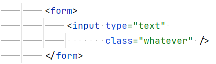
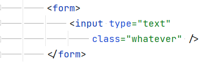
if you change tab with then your space alignment breaks
No, it doesn’t? Here’s the exact same text content with different tab widths:


The tabs are smaller but the spaces are the same, so the alignment remains.
But with tabs each contributor is free to choose how the indent looks. If it looks horrible on some system, that’s a configuration issue.
Tabs make more sense because that’s exactly what they’re for, indents. Ignoring how it looks, which makes more semantic sense for an indent, <indent character> or <space character><space character>? You wouldn’t use a bunch of spaces to indent a paragraph, so why would you use it to indent code?
Generally aligning stuff isn’t nice. But if you do, it’s tabs up to whatever level of indentation you’re at then spaces the rest of the way. So you wouldn’t have to assume a tab size. And the tabs and spaces have different semantic meaning (indent vs alignment) so mixing them makes sense. It’s even built into Jetbrains IDEs, where it’s called “Smart Tabs”.
Although really just adding a level of indent is better than aligning.
Ukraine will be in Moscow any day now!
Sounds like you want a few new reddit features when this site is more modeled on old reddit as many people prefer that.
> On post listings images thumbnails are too small, and the post has no direct link to the image.
How big would you want them to be? From a quick check they seem to be about the same size as new reddit’s “classic” mode, about 100px wide by 80px tall. The main difference is lemmy doesn’t crop the image to make it fix that box exactly.
And they do have a direct link, you should see it when hovering on the thumbnail, and middle clicking will open it in a new tab.
> I am not using old Reddit design. I like being able to open a post, and at the end close it (click to the side of it) and be back to the listing. On Lemmy I have to work with tabs or back navigation.
Those are pretty different UX philosophies and I doubt Lemmy would go for the former. Personally that’s one of the things I hate about new reddit. All I can say there is middle click is your friend for opening new tabs.
> Comment upvote and downvote should be to the side, like on posts. That’d be more obvious and visually consistent.
The idea there is that you have to actually read through the comment before providing your opinion on it.
> Dropdown for reply language selection is suboptimal to say the least.
How else would you accomplish that?
> Edit should be a primary toolbar action. Not hidden within a collapsed section.
Yeah probably.
> But then visual separation is missing again between the different types of actions.
What do you mean there? There’s decent spacing and different icons. I can’t think of anything else to do besides color.
(As a note: I contributed a bit to the functionality of post listings, but I’m not a lemmy dev)
I’m curious what your problems with the UI are? To me it’s pretty close to old reddit.

Hi, I’m a dev from hexbear and it looks like my first UI changes (relating to post listings) were included in this release.
Here are the changes I made:
I’d love to hear any feedback or ideas anyone here may have.


Sounds like a coup might be incoming.