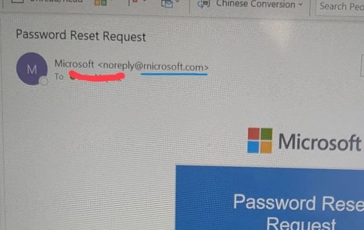
A sophisticated phishing campaign is currently leveraging a subtle typographical trick to bypass user vigilance, deceiving victims into handing over sensitive login credentials. Attackers utilize the domain “rnicrosoft.com” to impersonate the tech giant.
By replacing the letter ‘m’ with the combination of ‘r’ and ‘n’, fraudsters create a visual doppleganger that is nearly indistinguishable from the legitimate domain at a casual glance.
This technique, known as typosquatting, relies heavily on the font rendering used in modern email clients and web browsers.
Back to monospaced fonts then.
Honestly not a bad idea for things like filenames and URLs.
I’ll go variable width fonts, with it without serifs, for a wall of text… But for something short and critical I want to trust what I’m seeing.
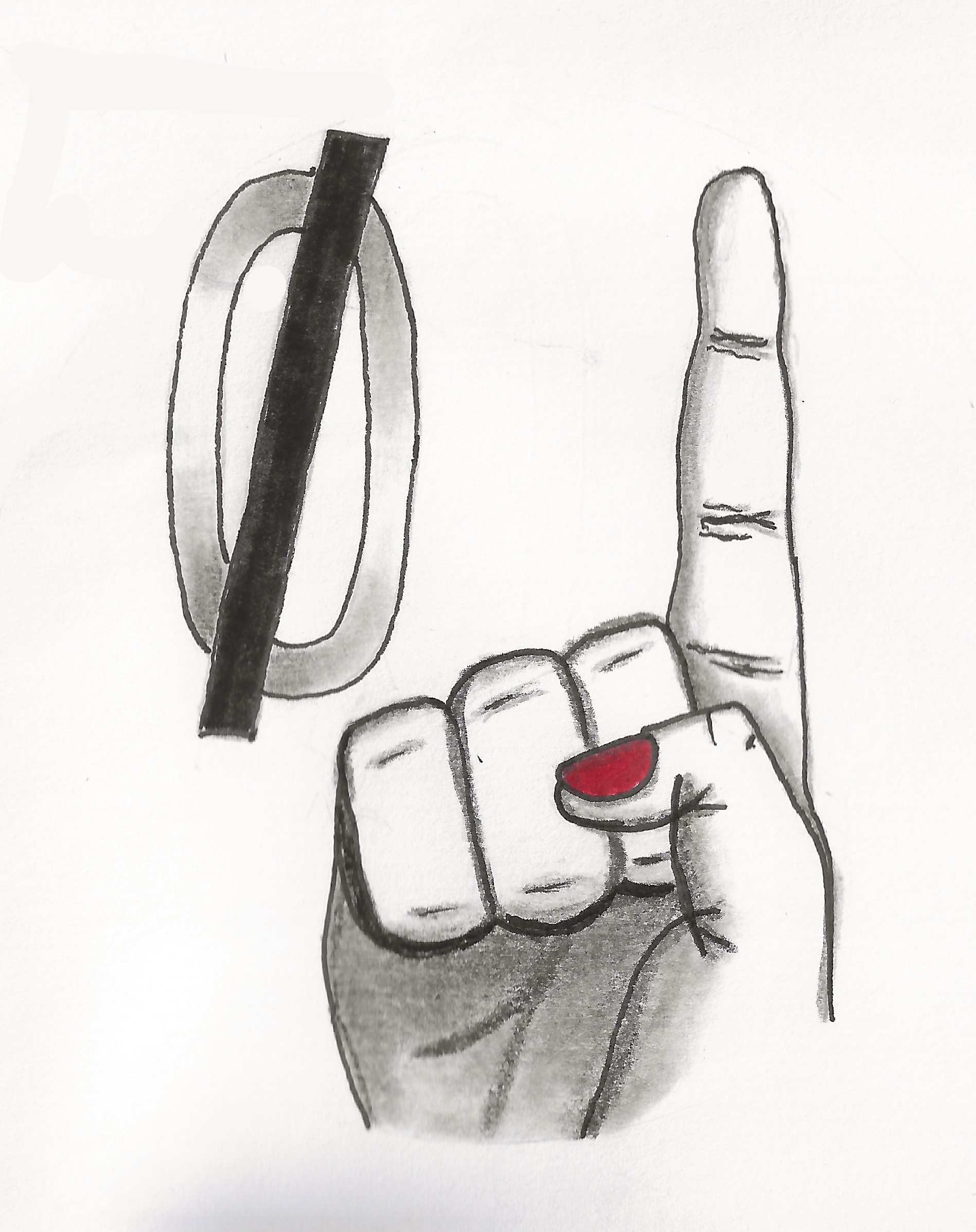
Also bring back the line through 0s so you know it’s a number.
l also replaced 'I’s with 'l’s and vice-versa in some of my previous comments and haven’t yet seen anyone react to them.
Hopefully someone finds out the ones I did today.
Well, here’s 1, l spotted:
l also replaced 'I's with 'l's and vice-versa in some of my previous comments and haven't yet seen anyone react to them. Hopefully someone finds out the ones I did today.l did something simiIar in my original repIy, but it Iooked too weird, so gave up.
(0r did l?)