I really don’t like the design of the progress pride flag, and I couldn’t really put my finger on it until I saw this: https://nava.org/good-flag-bad-flag
For reference, here is the flag I’m referencing as “bad flag”:

And here is the original:

So, the original has too many colors, but it’s the colors of the rainbow. In order. It’s recognizable from really far away, and it’s dead simple to draw.
With the Intersex flag, that’s 14 colors. There are three shades of “purple”. The circle won’t be visible from far away. The chevrons are too thin to be very recognizable from far away.
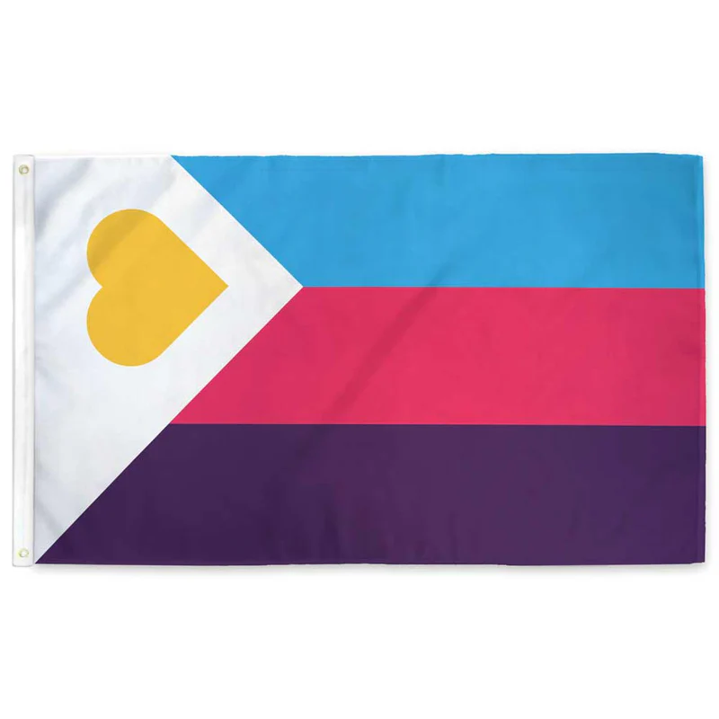
It’s not like there aren’t good pride flags. Like there are AMAZING ones:


Edit:
In case you don’t know what these are: https://flagsforgood.com/collections/pride-flags


That’s not actually the original pride flag. That’s the one with 2 mission stripes that were taken away due to cost. The original had turquoise instead of blue and a pink and indigo stripe, so one color more than the rainbow. Rainbows have red, orange, yellow, green, blue, indigo, and violet.
The 8 striped also symbolized different things. https://en.m.wikipedia.org/wiki/Rainbow_flag_(LGBTQ)
I agree with what you’re saying. As they keep adding more things to the flag, it becomes cluttered and harder to see.