I really don’t like the design of the progress pride flag, and I couldn’t really put my finger on it until I saw this: https://nava.org/good-flag-bad-flag
For reference, here is the flag I’m referencing as “bad flag”:

And here is the original:

So, the original has too many colors, but it’s the colors of the rainbow. In order. It’s recognizable from really far away, and it’s dead simple to draw.
With the Intersex flag, that’s 14 colors. There are three shades of “purple”. The circle won’t be visible from far away. The chevrons are too thin to be very recognizable from far away.
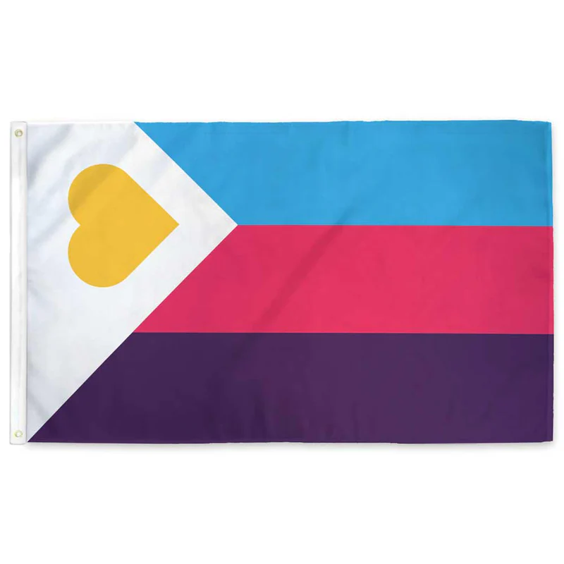
It’s not like there aren’t good pride flags. Like there are AMAZING ones:


Edit:
In case you don’t know what these are: https://flagsforgood.com/collections/pride-flags


I’m of the option that the original rainbow flag is still the best. It was meant to include everyone under the rainbow so trans people and others are already included.
The Progress flag stands for the progress that has been made and the progress that STILL NEEDS TO BE MADE against racism and transphobia as well as memorializing those we lost to AIDS.
So yes, while the original flag is meant to include all the LGBT+ communities, progress stands for more than inclusion for a lot of us ✌️
My problems with the progress flag and the trans rainbow flag are not with the groups or ideas they are ment to express.
First like OP I think they are bad flag designs. To busy and lack the simple design a flag should have. I also just don’t like the look.
Second there is value in a consistent recognizable design like the rainbow. I spot all sorts of variants and often don’t know what they are supposed to mean.
I also don’t think there should be spefic meaning to the parts. Saying this color stripe is this group and that color is another group is problematic.
The rainbow colors were meant to symbolize broad inclusion. Everybody under the rainbow. Red isn’t gay, blue isn’t lesbian, etc. (I know some have tried to add that after the fact).
When you start adding spefic groups to the flag you start having included groups and excluded groups. So as much as I support trans rights and think they belong in the community I don’t want any spefic group in the flag.
You then get groups that are not included and want a new flag to included them. Like we are seeing with the trans flag causing groups to want the progress flag. Pretty soon the rainbow is going to look like nascar with logos everywhere.
A simple consistent flag with the message of broad inclusion is better.
I think you’re missing the forest for the trees and I don’t think I’ll be engaging with your slippery slope argument ✌️
Was it meant to represent black and indigenous people?
Does it need to?
Not sure why you would ask that. I’m responding to this claim:
Ah I get your point. Native and black people are their own sexual identity. Got it.
I’m responding to the claim that everyone on the progress flag is already included on the pride flag. I am not expressing an opinion about whether a flag should or should not represent whatever group of people. Am I wrong that the person I am responding to implied that this?