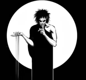
Again, based on @FixedFun 's original designs so creds to them for the idea.
Thoughts about these ones? For the one on the right, I tried a different angle to hopefully give more bird and less bald man.
Ok. I am someone who feels like kbin doesn’t really need a mascot at this point in time. It seems really early and tbh the whole thing feels a little forced. Really not into the bird design either. I just don’t get it…
But holy shit this new icon on the right has 100% changed my mind.
It is adorable and I’d put that on the first page of my phone home screen, no questions asked.
Well done.
oh wow i didnt expect that turn around in your comment lmfao. i am so happy you guys like it, i just whipped it up expecting it to fail and was like hmm not so bad, let me send it out into the world and see. its great to see positive reactions :D
I really like the right one. It oozes confidence :)
thanks! bald man mostly gone I’d hope!
Definitely the right one! Exactly what I wanted with the last poll!
im glad i could fulfill that :D
The second one improves the original concept so much, I really like it! ☺️
thank you C:
The second one (right) is so much better than the previous ones. It loses the ‘bald guy’ look that the other ones have.
I still maintain that we don’t need a mascot, but… that one would be good if we need one.
I really don’t want a logo that reminds me of that sexist shithead troll of a Reddit supermod.
who?
It can’t be done, but I would be tickled pink if the left image was the default icon and the right image was the icon if I have notifications waiting for me. 🤣


