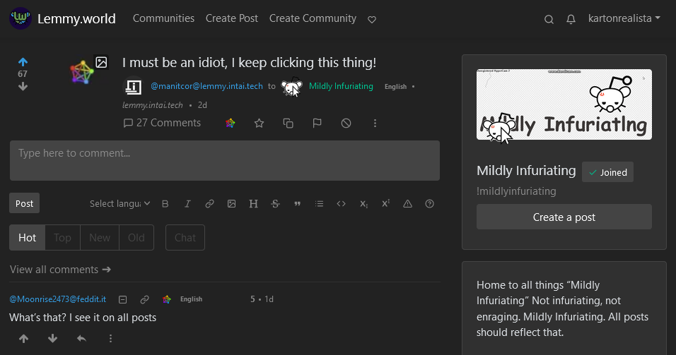
I still don’t understand what it is or why is there…
It points to the lemmy instance the post has been published on. It is useful if you want to share a generic link to a post with someone and maybe don’t want to share the information on what instance you created your account on, because the other permalink button always references to the instance of your account.
Ohhh! So, if I’m understanding correctly, I can share that link to another… Instance? And it cuts me, the middleman, out of the link chain, kind of?
Exactly!
Good to know! Thanks!
Also very useful for checking the sync on a post for people selfhosting. I made a thread about it earlier today because my instance is missing a number of comments, and it seems like it’s happening to quite a few of us. Ironically, my instance is missing 6 comments from my own post compared to the lemmy.world copy.
Lemmy is divided in all connected servers or instances, where they host their own communities. The button brings you to the webpage where the post is being hosted on, if its different from the server you are connected to.
At the start I thought it was the darkmode switch, weirdly prominent way to show that…
It links to the original server that the user posted on. It can be very useful for navigating around the fediverse. However I will say I don’t use it all that much.
It is a direct link to a specific comment.
This thing isnt on jeroba so I forgot it’s a thing lol.
What’s that? I see it on all posts
It opens a link to a post in its own instance. So for example

this is how your comments looks for me with this button. As you can see I’m not logged in, because it’s a different instance compared to what I use. This is what things look like when I click the chain icon to the left of it:

Here I’m logged in, because it’s your comment opened through my instance.
Thank you for finally explaining this, I’ve tried explaining it to people 3 times now and failed every time. Will link this next time someone asks. :)
Nice
69
Well, when you need it its extremely useful. Maybe if its moved under the three dots extras might be more user friendly
Three dots doesn’t work for us on lemmy.world. 😅
How come?
I’m not sure, client.js has entries for displaying and interacting with the ‘more’ button; it just hasn’t been doing anything.
Oddly enough, I think it was just fixed for comments but still not on posts. Probably something in showMoreButton, though from what I see of it everything looks normal.
🤷
Works for me? iOS Safari.
I’m with you on this one, I feel like somethings should be more obvious than others, I think overtime people develop new apps and features that make the UI a lot more workable
I get it, it’s such a nice and shiny icon it gotta do something good!
Is there a better way to get back to your feed when on an iPhone?
fun, it means different things in different context’s in different platforms. i see a fun set of discussions in the future.
Im using the docker build in the ansible playbook, so it jumps to the instance the post is on. Its vibrant so i think i just keep hitting it when i mean to hit the link.
If you are on browser you can just go back. Are you using an installed client?
I’m using a homepage link to the webpage via Safari and on 16.5 I don’t have a back arrow available. Are there recommended iOS apps for Lemme?
You can swipe to go back like in any app.
There is an iOS app in Beta: https://testflight.apple.com/join/xQfmkJhc
Thanks! Using Mlem now and loving it.
sparkly


