At this point, after so many design updates, my tab bar is restyled with css, my window manager knows that the browser is always fullscreen and never gives it a title bar, except when it does but then it’s just the plain normal system one, all the extra toolbars and widgets that can be removed have been removed, and I absolutely never see the “new tab” page. I’m not going to care if the back/forward/reload buttons look slightly different. Here’s hoping I don’t even notice this one…
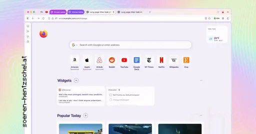
You’ll notice in the image above that web page content isn’t flush to the sides of the browser window, nor does it extend up to the tab bar. Instead, web content sits ‘framed’ within a rounded container
WTF Mozilla are you fucking kidding me
Literally said “Oh god please no” out loud when I read that. I hope we can change that/Waterfox would let me change that when it’s out
Just like the last Redesign, people are going to absolutely despise it for like two weeks and then people are gonna get used to it. As it always happens when software does a Redesign.
FFS, why does everyone has to waste so much screen space on those damn rounded corners and shadows and paddings for them? Why those damn designers across all companies can’t just calm the fuck down and leave the tools be tools and not some form of art?
Is there any research about it?
What if someone puts a pixel at 1,1?
“Art”. Doesn’t even look good. Everyone’s doing the same modern overdone boring design.
I really wish every app would stop making its own theme and just use the system one.
What’s with the border around the render area? That can be turned off, right?
I actually think it looks nice. The tabs are a bit wonky though
I like it too!
oh god another one? i still haven’t recovered from photon
trash
installs it anyway
I would’ve made it more minimal. Doesn’t look the best, doesn’t look the worst. Seems like a wasted opportunity.
RIP my workflow, again. I just hope Sidebery catches up quickly and I don’t have to modify my CSS a lot.
Looks awful.